HOUSTON STALLIONS:
AN NHL EXPANSION TEAM
The Houston Stallions are an NHL expansion team, set to join the league at the start of the 2020-2021 regular season. The Stallions will be the 32nd team in the NHL, joining the league three years after the Vegas Golden Knights, and one year before the currently unnamed Seattle expansion team. There are several reasons why I chose Houston for my expansion team. They are the fifth largest city in Canada and the US, and the largest without a professional hockey team. They also already have a team in the other three major sports leagues (MLB, NBA, and NFL).
Art Director: Abby Guido
NAME & LOGO
I decided on The Stallions for my team name because every year in Houston there is an event called the Houston Livestock Show and Rodeo. It is a huge part of the culture of the city, and everyone in/around Houston knows what it is (like Mardi Gras in New Orleans). At this show and rodeo you see all kinds of livestock and animals, so I felt that the Stallions would be a great representation of Houston.
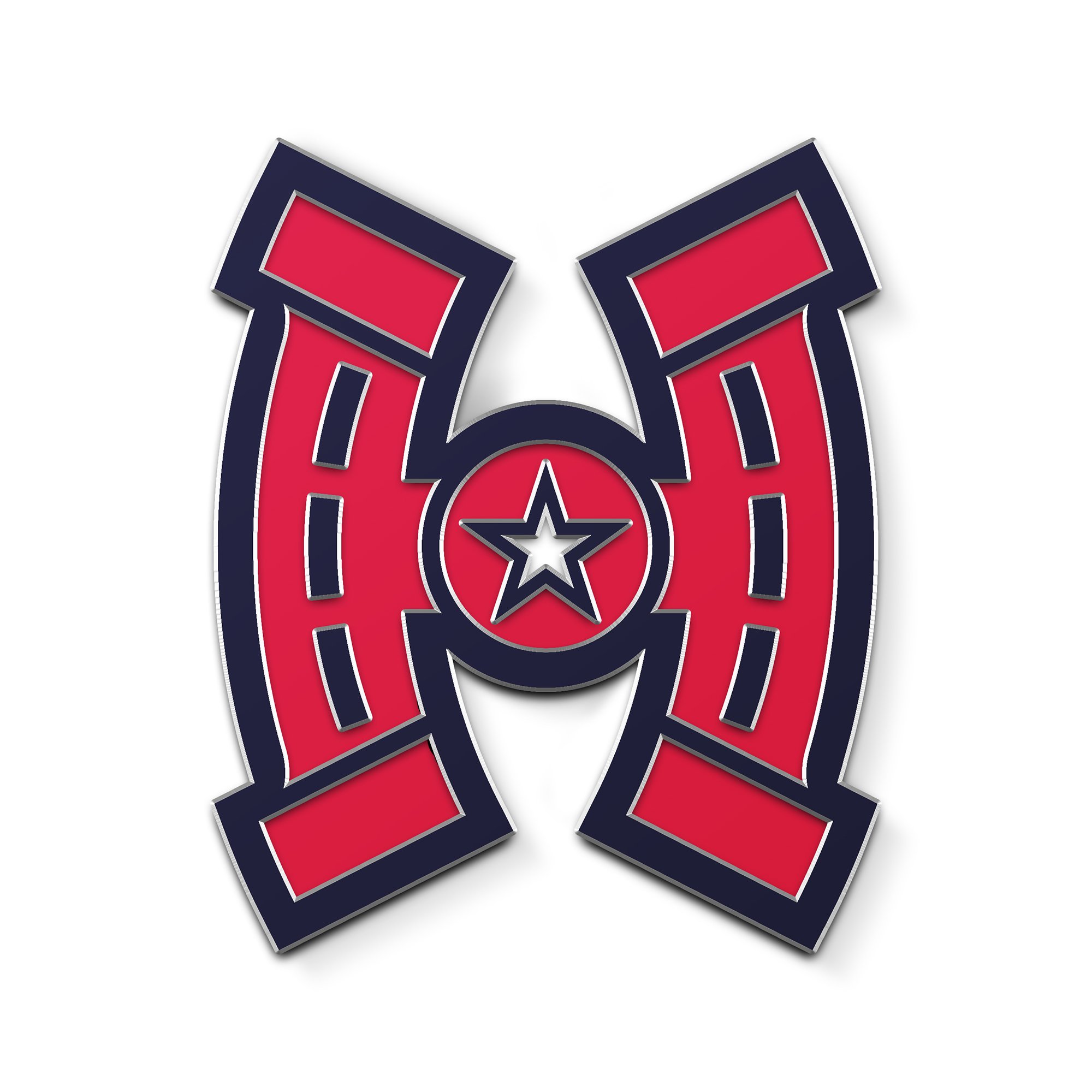
The concept for the logo is a combination of a horse shoe and the letter “H”. In the center of the logo is a star to represent Texas, the Lone Star State. The colors originated from the Texas State flag. Along with the full color primary logo are two, solid color logos, one all. white and one all blue of various uses.

STYLE TILE & SLOGAN
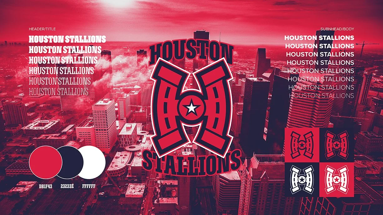
I’ve put together a style tile in order to show what the brand elements for my team will look like. In the center is the primary logo with the team name word mark. On left is the various weights of the primary typeface I’ve selected for headers/titles/etc. On the right is the weights of the typeface for body copy and smaller text. The bottom left is the colors of the team and their HEX codes. Lastly, in the bottom right is the white and one color logo.
The team slogan for the inaugural season is “Bear Down”, which is used throughout this project. Bear Down is a common term used in the rodeo world. It means to “settle in, make your mean face and nod your head” in other words, to get ready for what is about to go down.
UNIFORMS
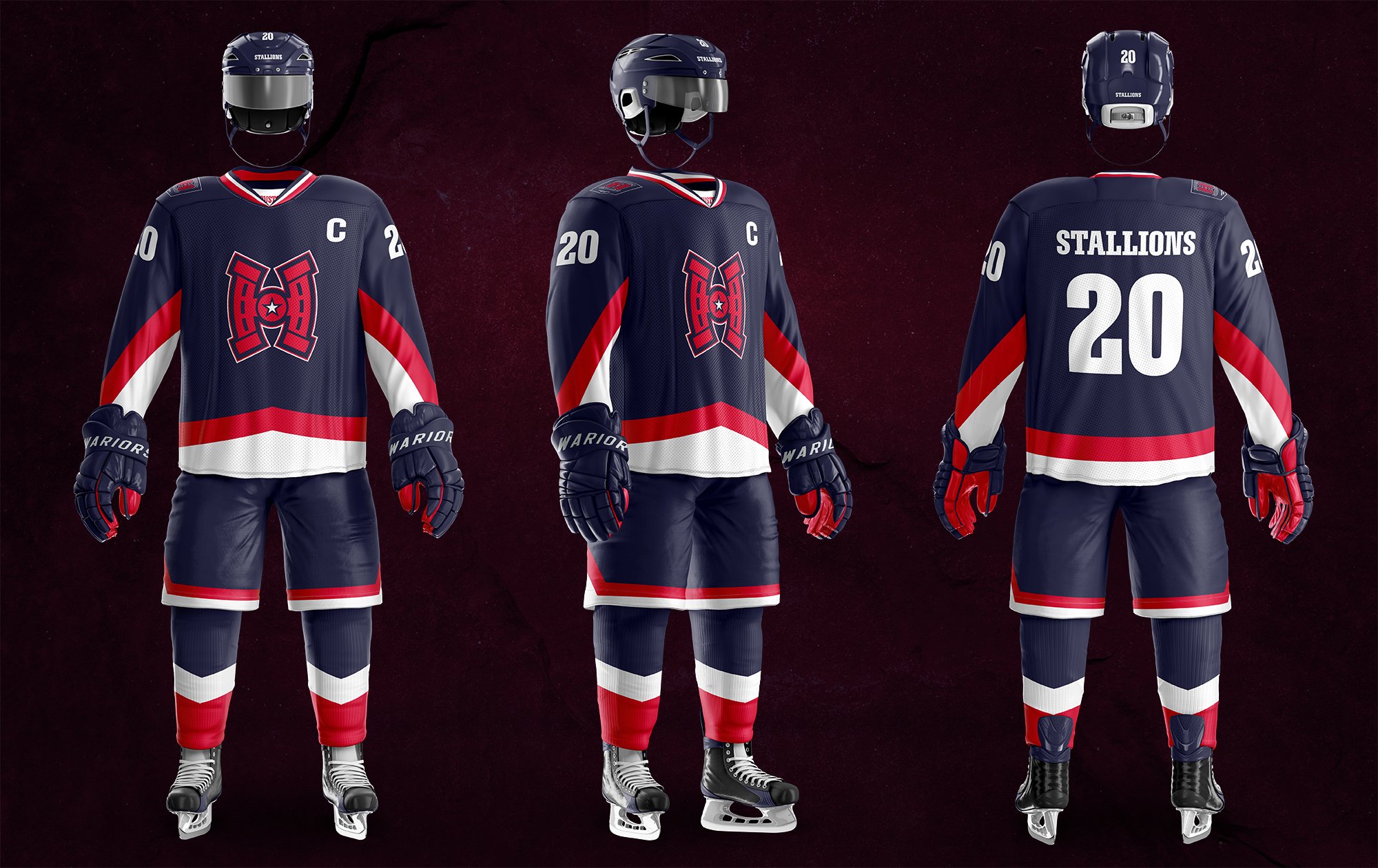
For the uniforms I decided to use the blue as the primary color (for the home jersey) in order to make the logo stand out more than if it was red on red. I wanted to reference the state flag by using the red and white stripes on the sleeves and the base of the shirt. That theme also continued into the shorts and the socks as well. All NHL teams use white as the primary color for the away jerseys, and mine are no different. Also included on both the home and away uniforms is an inaugural season patch on the right shoulder.

SEASON TICKET PACKAGE
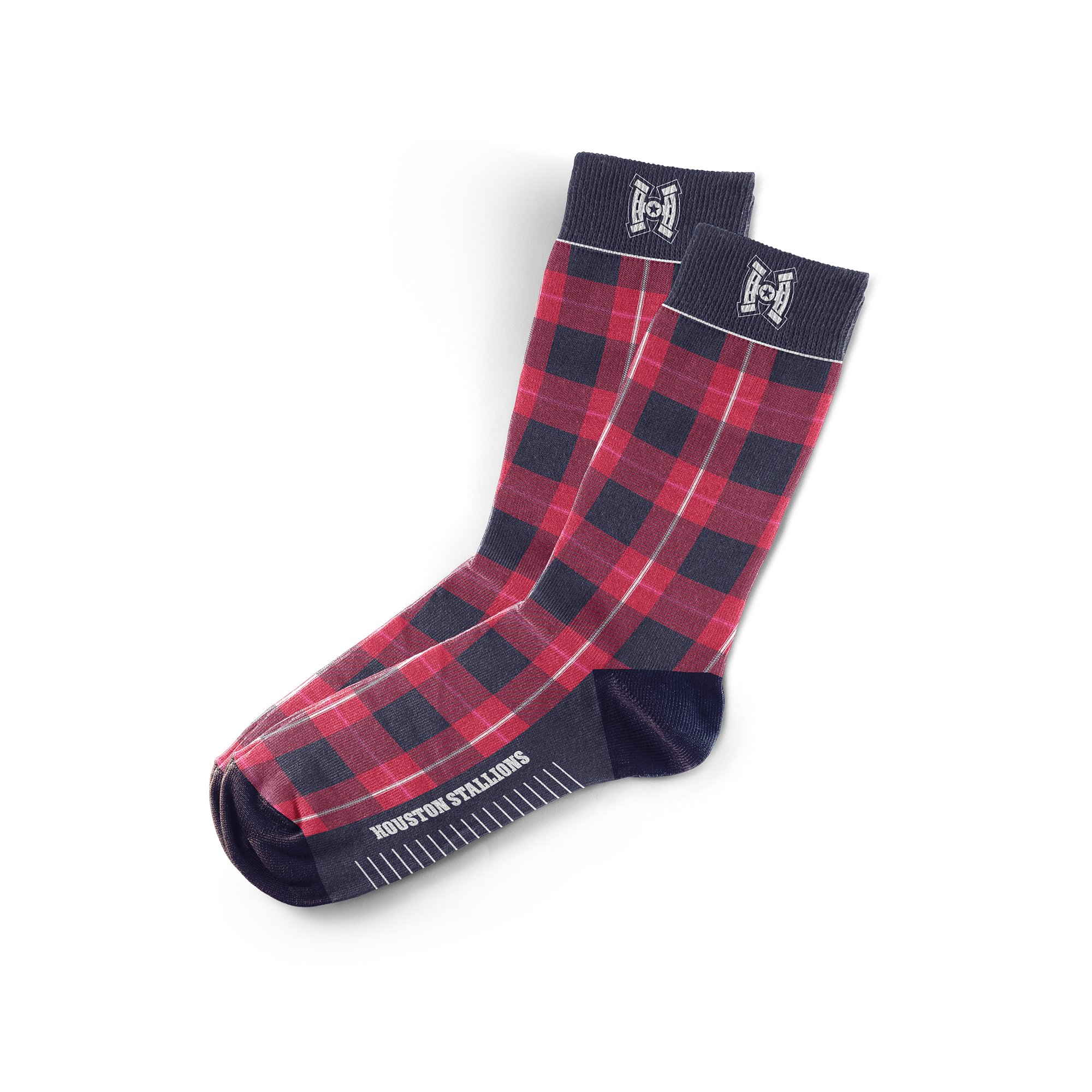
Everyone who signs up for season tickets will receive a special merchandise package delivered to them. Included within are a pair of team branded socks, promotional tickets for the games, an official game puck autographed by a random player, and a pin of the team logo. Each of the items in the package is branded using the same styles as seen in the style tile. One new element here is the texture used in the text and images. This is included here to give a feeling of roughness and resiliency.


TICKETS & MERCHANDISE
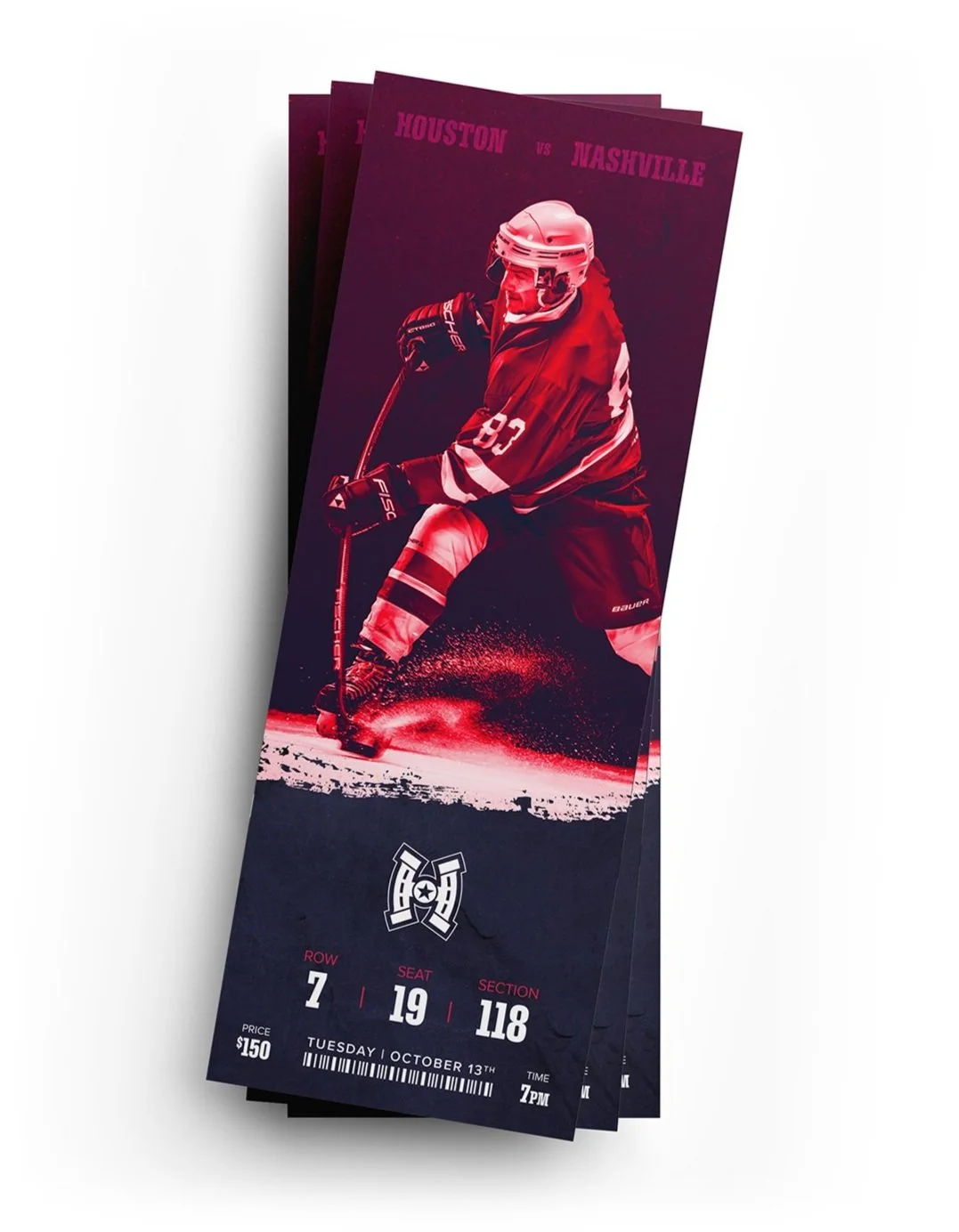
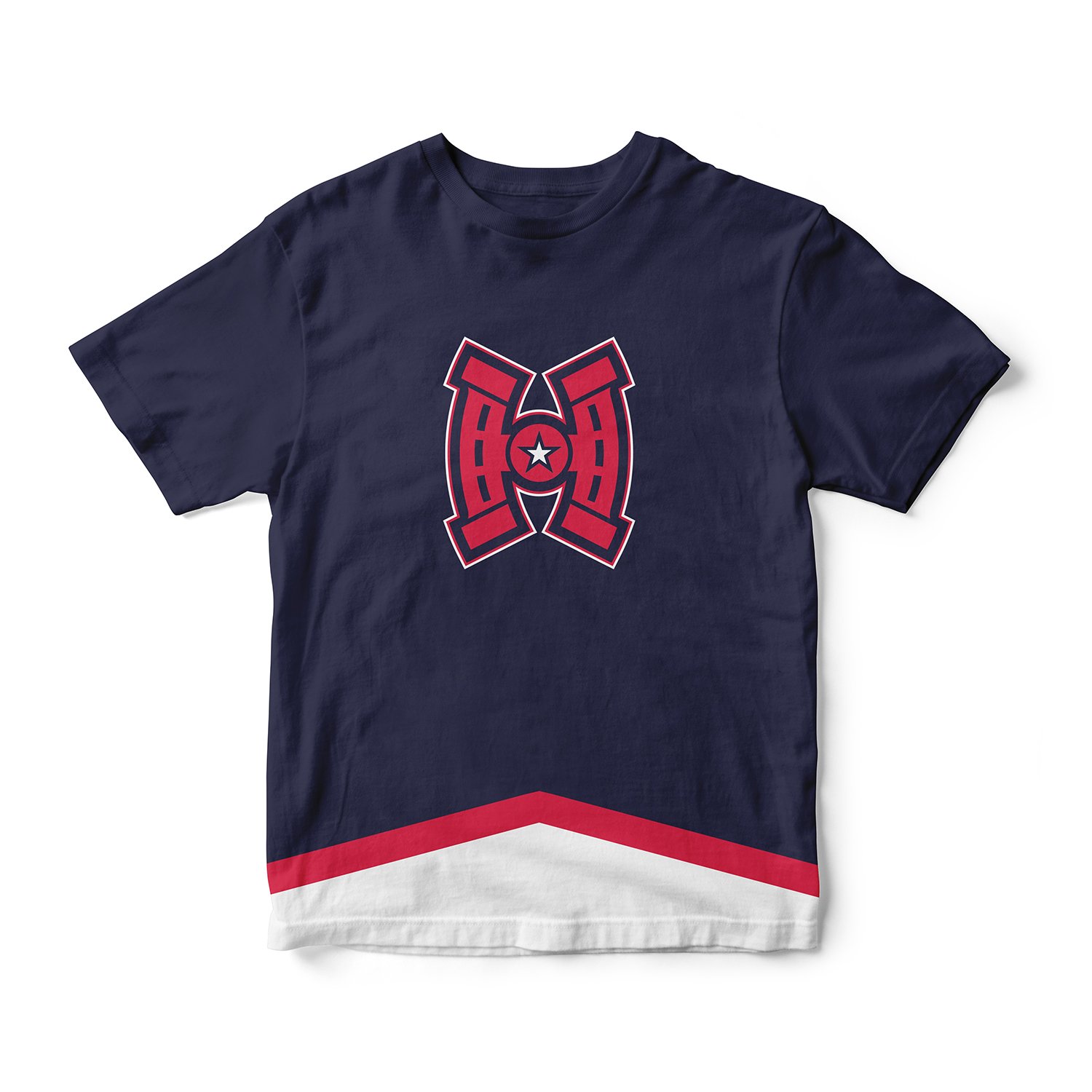
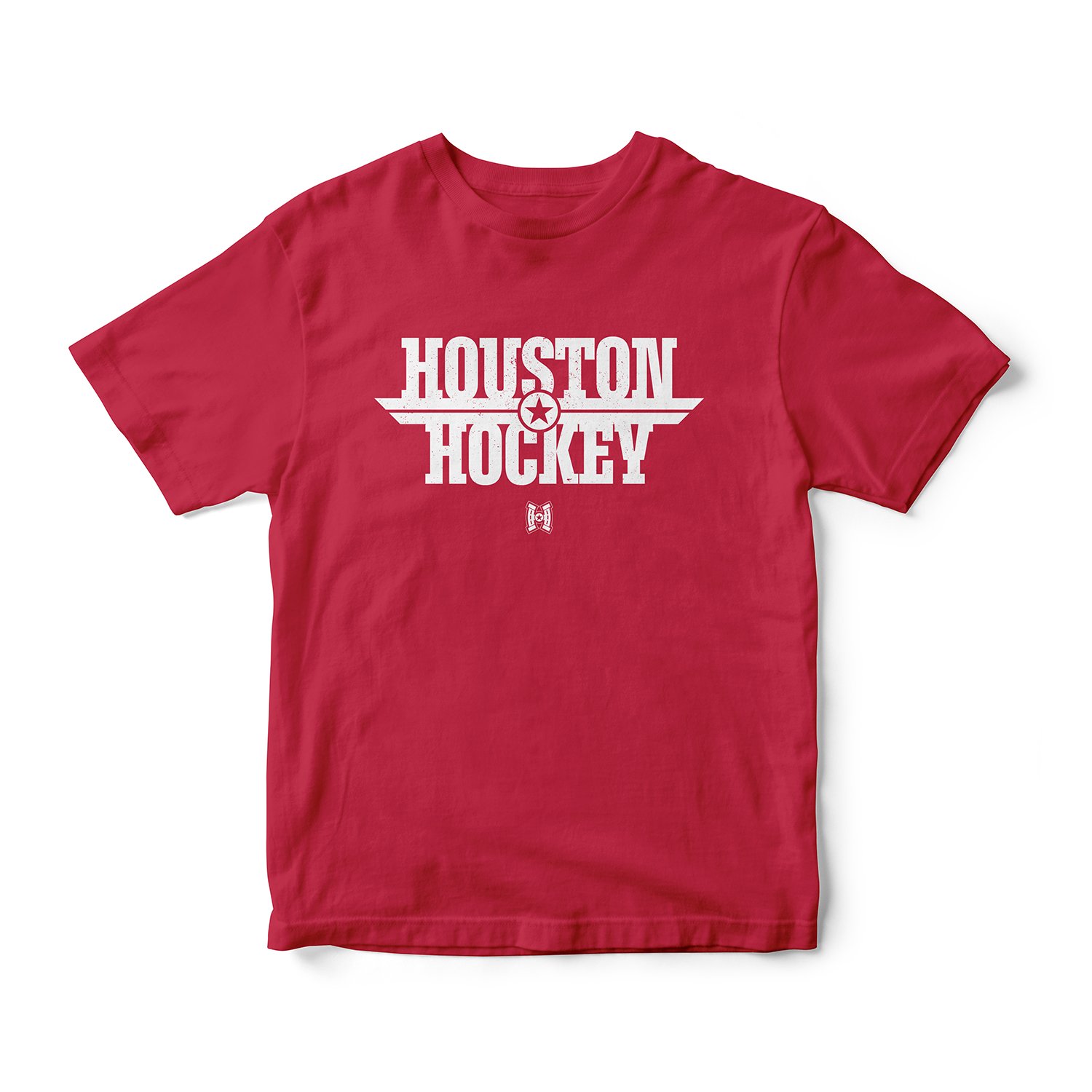
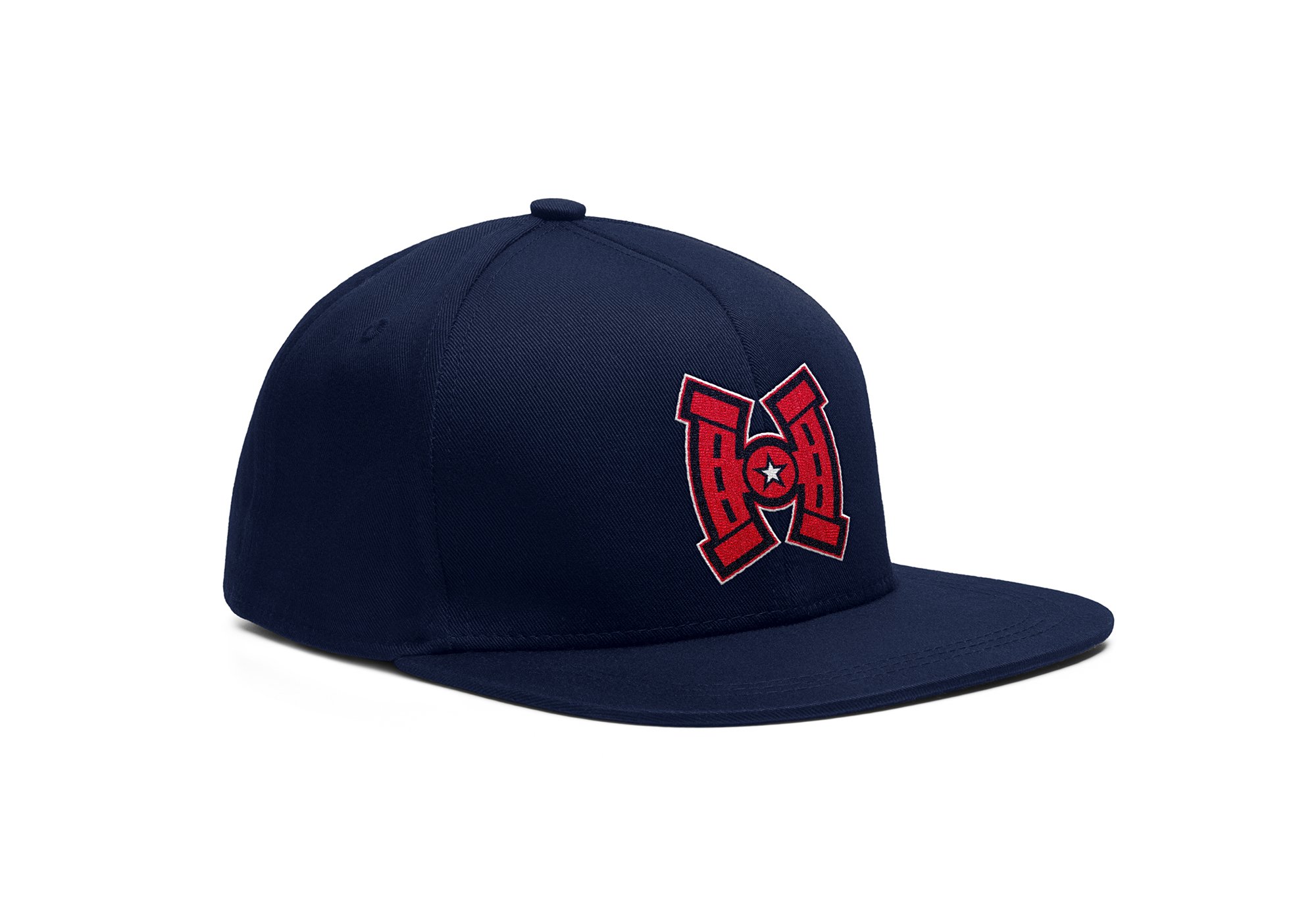
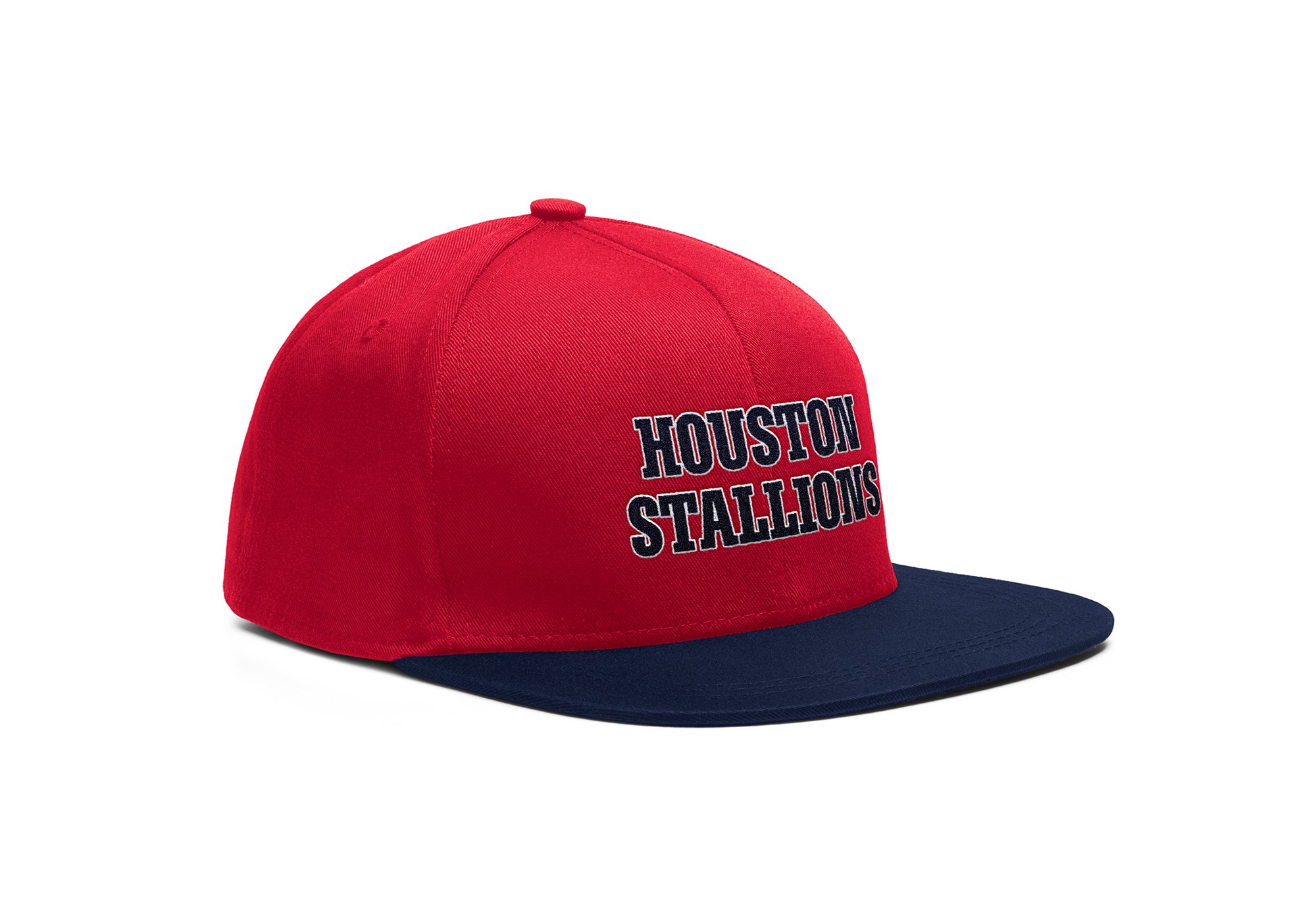
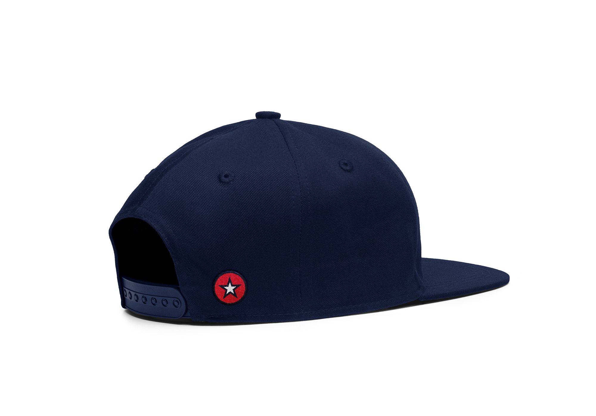
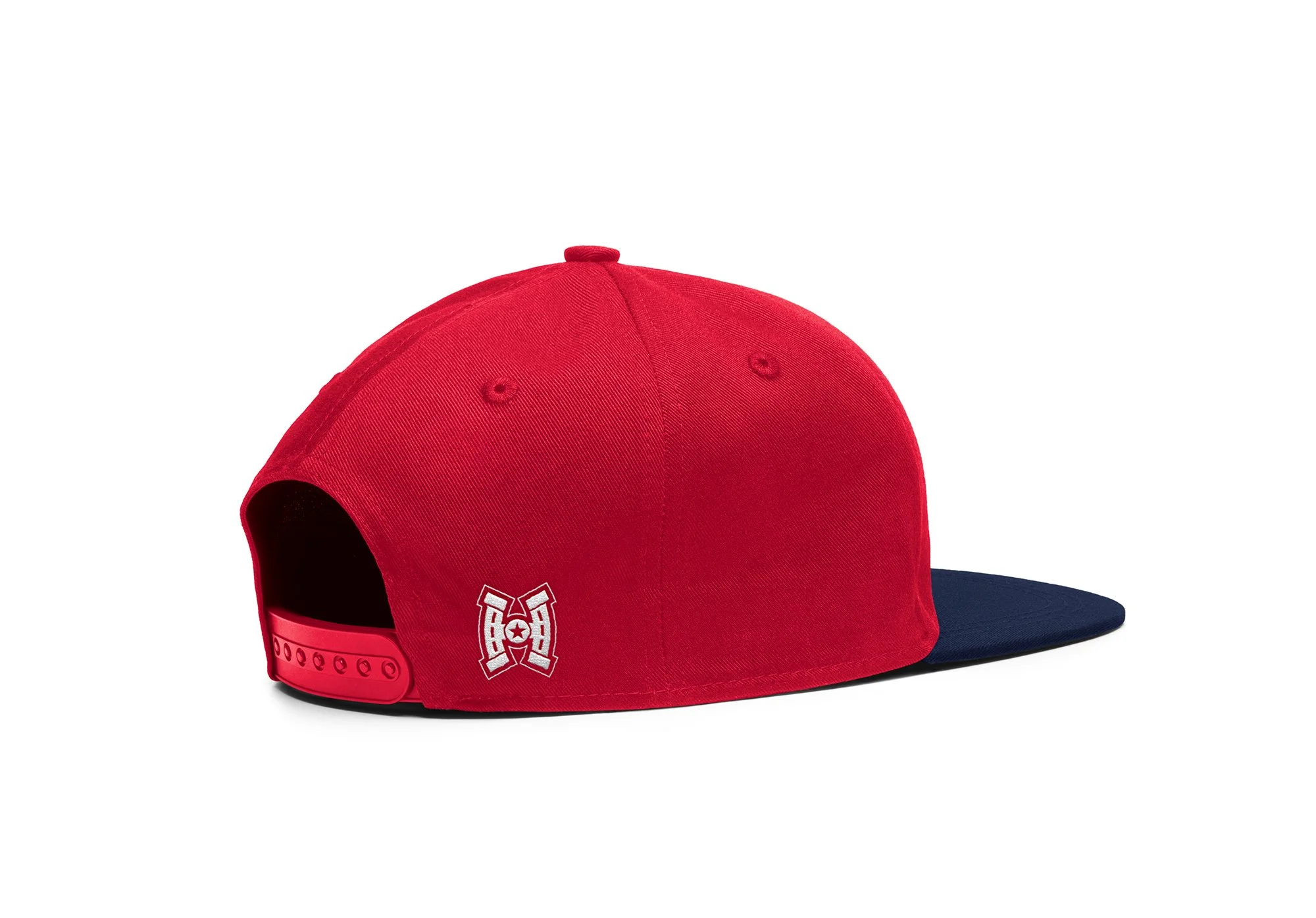
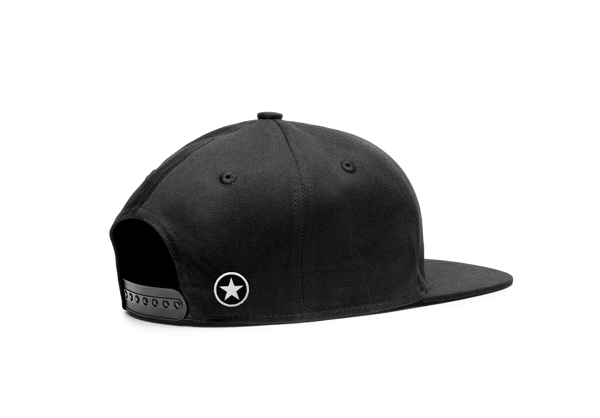
These are the game day tickets. These are available to anyone looking to purchase tickets to a single game. They feature a player from the team, along with the city of the opponent for that game at the top. The seat information is located at the bottom in the shape with the textured divider to separate the section from the image. It uses this texture to give the sense of toughness. Below is the team branded merchandise. There are three hats and three shirts for fans to purchase. There are two hats with the logo, one in color and one in black and white. Each of these hats has a circle with a star on the back, which was taken directly from the center of the logo. There is also one red hat that has the team name with the logo in white on the back. There are also three shirts for fans. One has the logo and the stripes at the bottom to replicate the jersey. One has the saying “Houston Hockey”, and the last one has the team slogan “Bear Down”. These are all designed to further extend the brand of the Houston Stallions.


MOTION GRAPHICS
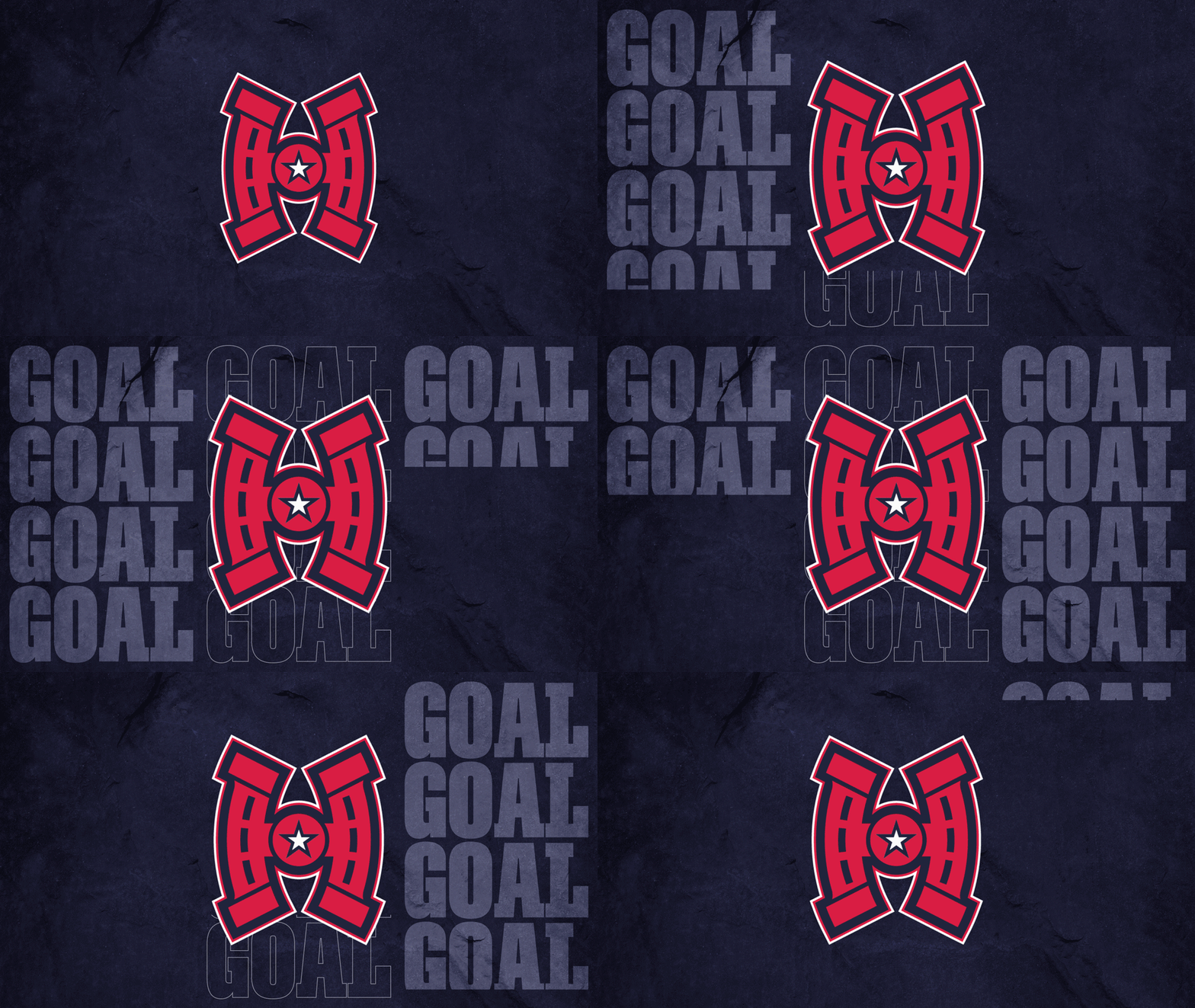
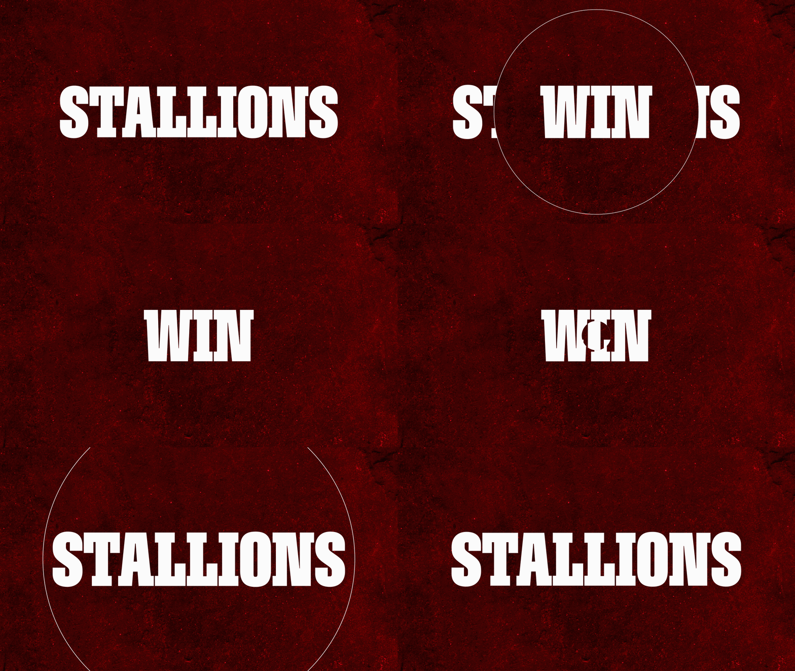
The last part of this project was four looping animations that will play on the jumbotron during the pregame warm ups, and the actual game. First is a logo animation that can be used throughout the game. An animation to play after the Stallions score a goal. One to play when the Stallions go on a power play. Lastly, one for when the Stallions win the game.


